

The Gallery Templates page in ShutterPress gives you full control over how your galleries look and behave. It’s where you define global defaults for new galleries, manage performance and layout options, and set up the client experience.
You can create as many Gallery Templates as you wish and assign them to Galleries.
You’ll find the page under
ShutterPress → Gallery Templates in your WordPress dashboard.
Layout Options #
The Layout Options section controls the overall appearance and structure of your galleries. These settings apply to all new galleries by default, but can be overridden on individual galleries if needed.
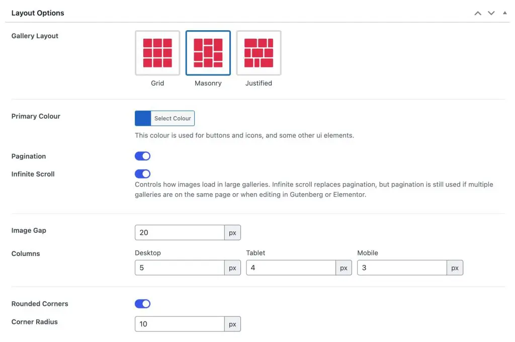
Gallery Layout #
Choose how your images are displayed.
- Grid – Fixed rows and columns, ideal for clean, uniform layouts.
- Masonry – Dynamic layout where image heights vary naturally, perfect for mixed aspect ratios.
- Justified – Aligns image rows evenly for a polished, full-width look.
Primary Colour #
Select a global accent colour used for gallery buttons, icons and other interface elements. This helps match the gallery to your site’s branding. This option will try to find defaults from the theme for you to choose from.
When you set a primary colour a darker accent colour is also set automatically for elements such as button hovers.
Pagination #
Enable pagination to break large galleries into multiple pages. Useful if you prefer traditional navigation or want to limit the number of images loaded at once.
Infinite Scroll #
When enabled, new images load automatically as visitors scroll. This replaces pagination for seamless browsing.
Pagination is still used automatically when multiple galleries appear on the same page or when editing in Gutenberg or Elementor.
Image Gap #
Set the space between images in pixels. Increasing the gap gives a more spacious layout, while smaller values create tighter grids.
Columns #
Define how many image columns are shown on different devices:
- Desktop – Number of columns on large screens.
- Tablet – Adjust for medium-sized displays.
- Mobile – Choose fewer columns for smaller screens.
Rounded Corners #
Toggle to enable rounded corners for all images.
Corner Radius #
Set the radius (in pixels) of the image corners. Higher values create a softer, rounded look.
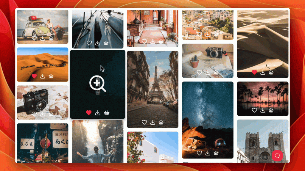
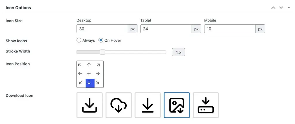
Icon Options #
The Icon Options section controls how gallery icons appear, their size, position and style. These icons are used for lightbox, download and other actions depending on your gallery setup.
Icon Size #
Set the size of icons on different devices:
- Desktop – The main size used for larger screens.
- Tablet – Slightly smaller for medium displays.
- Mobile – Compact for small screens. Sizes are defined in pixels and scale responsively.
Show Icons #
Choose when icons appear:
- Always – Icons are always visible on top of images.
- On Hover – Icons only appear when the user hovers over an image, giving a cleaner look.
Stroke Width #
Adjust the thickness of icon lines. A smaller value creates finer, more subtle icons, while a higher value makes them bolder and easier to see.
Icon Position #
Select where the icons appear over each image. Options include top, centre, bottom, and corner positions. The blue highlight indicates the current selection.
Download Icon #
Pick which download icon style to use from the available designs. This icon is used in the gallery image and also in the lightbox.
Lightbox Options #
The Lightbox Options section lets you control how images open and appear when clicked. The lightbox provides a distraction-free viewing experience where users can browse through images in an overlay.
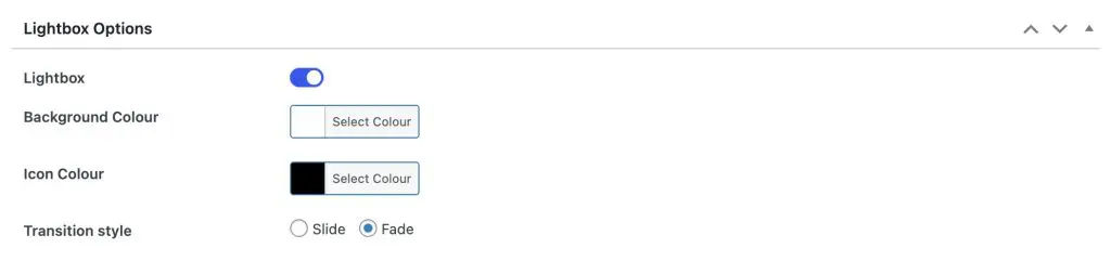
Lightbox #
Toggle the lightbox on or off. When enabled, clicking an image will open it in a full-screen overlay with navigation controls.
Background Colour #
Set the colour and opacity of the lightbox background. A darker background helps images stand out, while lighter tones can blend more with your site’s design.
Icon Colour #
Choose the colour used for navigation and close icons inside the lightbox. This helps ensure icons remain visible regardless of background brightness. The primary colour set earlier will be used as the hover colour for these icons.
Transition Style #
Select how images transition when navigating between them:
- Fade – Gently fades images in and out for a smooth, subtle effect.
- Slide – Slides images horizontally for a dynamic, modern look.
Hover Effects #
The Hover Effects section controls how gallery images react when a visitor hovers over them. These effects add movement, depth and visual feedback to make your galleries feel more interactive.
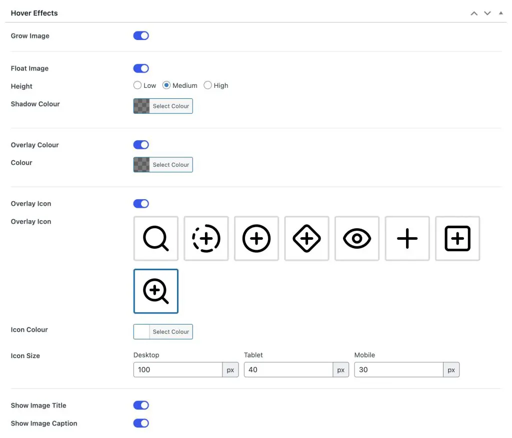
Grow Image #
Enable this option to slightly enlarge images when hovered. It adds a smooth zoom-in effect that draws attention to each photo.
Float Image #
Makes images lift subtly from the background when hovered, adding a sense of depth.
- Height – Adjusts how much the image floats (Low, Medium, or High).
- Shadow Colour – Choose the colour of the shadow cast beneath floating images.
Overlay Colour #
Adds a semi-transparent colour layer over images on hover.
- Colour – Select any colour and adjust opacity for subtle or bold overlays.
Overlay Icon #
Show an icon on top of images when hovered.
- Overlay Icon – Choose from several built-in icon designs.
- Icon Colour – Define the icon colour to match your gallery’s style.
- Icon Size – Set icon size separately for desktop, tablet and mobile.
Show Image Title #
Displays the image title over the image on hover.
Show Image Caption #
Displays the image caption on hover, below or alongside the title depending on layout.
Custom CSS #
The Custom CSS section allows you to add your own CSS directly to a gallery template. This gives full control over styling and layout beyond the built-in options.
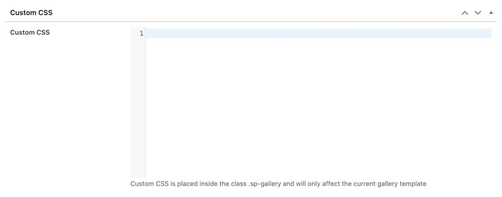
Use this field to enter any additional CSS rules you’d like to apply. The styles entered here are automatically scoped to the gallery using the .sp-gallery class, meaning they will only affect the current gallery template and won’t interfere with other site elements.
For example:
sp-gallery-item img {
  border: 2px solid #ffffff;
  transition: transform 0.3s ease;
}

.sp-gallery-item img:hover {
  transform: scale(1.05);
}
Tips #
- Keep your CSS minimal to maintain performance.
- You can use browser developer tools to inspect gallery elements before styling.
- To reset, simply clear the field and save the template.