


One gallery.
Unlimited personalities.
Give your WordPress photo galleries a look of their own.
Explore ten ShutterPress gallery templates, all using the same photographs, and see what changes when you switch the style.
Make any template your own.
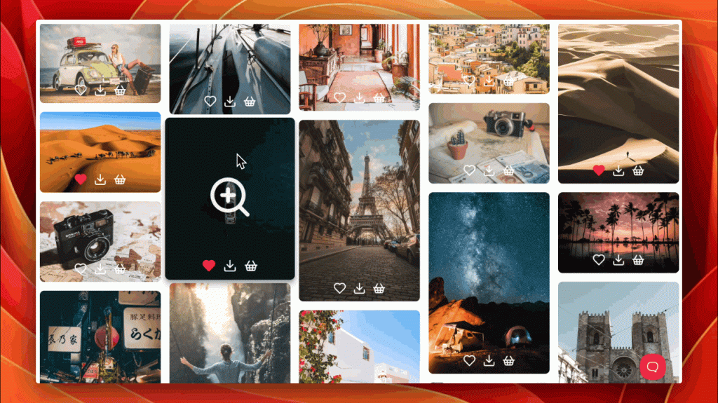
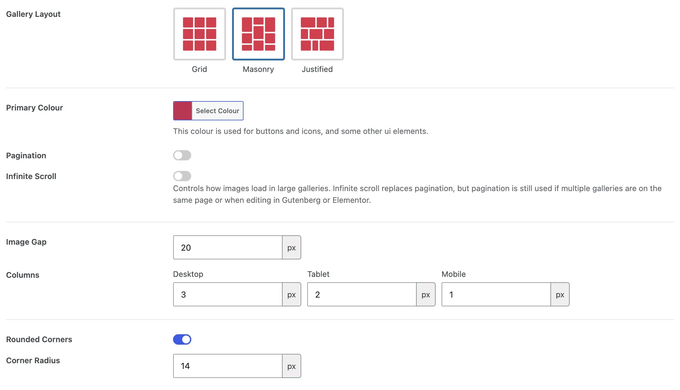
Choose a grid, masonry or justified layout, then adjust spacing, colours, captions, icons and hover effects in the ShutterPress Gallery Template editor.
Save a look once and reuse it across your portfolio or client galleries. Add custom CSS when you want finer control.

01 / Editorial dusk


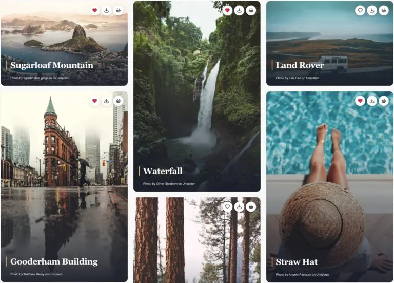
Serif headline over a dark lower gradient; pearl icons at the top right. The photo slowly zooms beneath the type.
View & copy the complete CSS — Editorial dusk
Paste this complete snippet into Gallery Template → Custom CSS.
Enable Show Image Title in the template and the favourite, download and purchase actions you want in the gallery.
The CSS supplies every visual rule used by example 1, including type, gradient, corners, icon styling and animation.
It needs no extra HTML or classes; layout, columns and gaps stay under the gallery’s own settings.
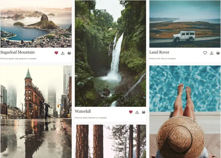
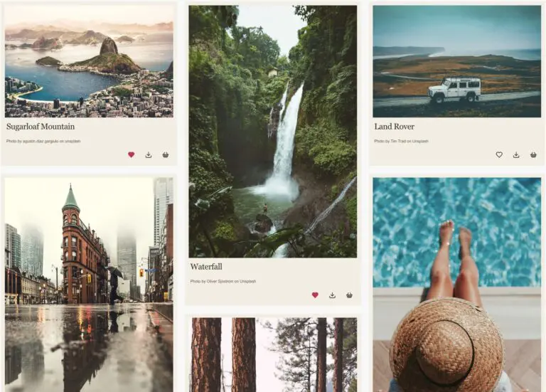
02 / Minimal photo notes
A square-edged photograph with a quiet white footer. The serif title sits on the left, the original photo credit below it, and simple outline action icons line up on the right, without pills, shadows or a photo overlay.
View & copy the complete CSS — Minimal photo notes
Paste this complete snippet into Gallery Template → Custom CSS.
Enable native image titles and your desired icons.
The photo credit comes from the widget’s existing caption attribute.
No extra HTML or gallery layout changes are needed.
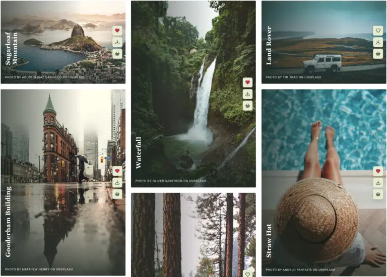
03 / Vertical field notes
A vertical headline climbs the left edge. Compact credits sit at the bottom, while the icons form a sliding rail on the right.
View & copy the complete CSS — Vertical field notes
Paste the complete snippet into Gallery Template → Custom CSS.
Enable native image titles and your desired icons.
Credits use the widget’s existing caption attribute when native caption output is disabled.
No HTML changes or extra classes are required.
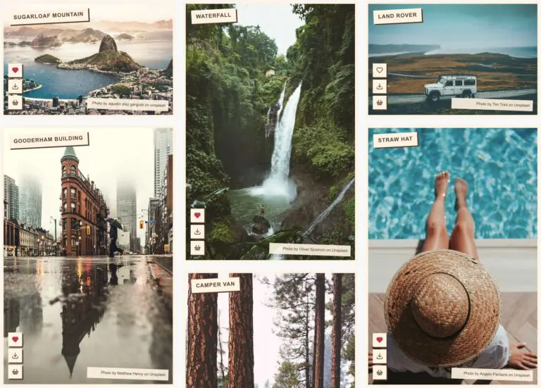
04 / Postcard stamps
The title becomes a cream stamp at the upper left, the photo credit a small lower-right label, and the actions line up at the lower left.
View & copy the complete CSS — Postcard stamps
Paste the complete snippet into Gallery Template → Custom CSS.
Enable native image titles and your desired icons.
Credits use the widget’s existing caption attribute when native caption output is disabled.
No HTML changes or extra classes are required.
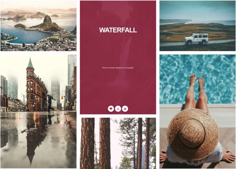
05 / Crimson reveal
A rose-coloured curtain slides over the photograph. Bold centred type and staggered icons appear together on hover or keyboard focus.
View & copy the complete CSS — Crimson reveal
Paste the complete snippet into Gallery Template → Custom CSS.
Enable native image titles and your desired icons.
Credits use the widget’s existing caption attribute when native caption output is disabled.
No HTML changes or extra classes are required.
06 / Museum label
A paper border and a generous lower shelf move the title, credit and icons outside the photograph, like a museum’s artwork label.
View & copy the complete CSS — Museum label
Paste the complete snippet into Gallery Template → Custom CSS.
Enable native image titles and your desired icons.
Credits use the widget’s existing caption attribute when native caption output is disabled.
No HTML changes or extra classes are required.
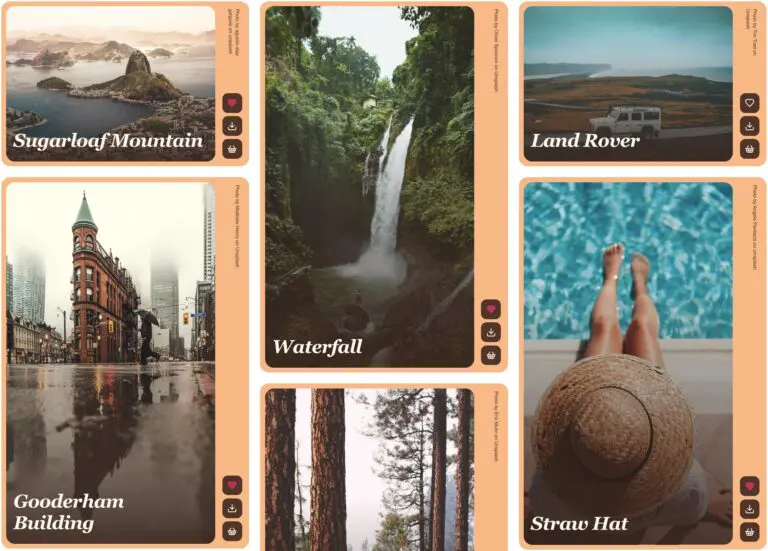
07 / Apricot sidecar
A dedicated action gutter sits outside the photo. An oversized italic headline rests over the image and the credit becomes a vertical annotation.
View & copy the complete CSS — Apricot sidecar
Paste the complete snippet into Gallery Template → Custom CSS.
Enable native image titles and your desired icons.
Credits use the widget’s existing caption attribute when native caption output is disabled.
No HTML changes or extra classes are required.
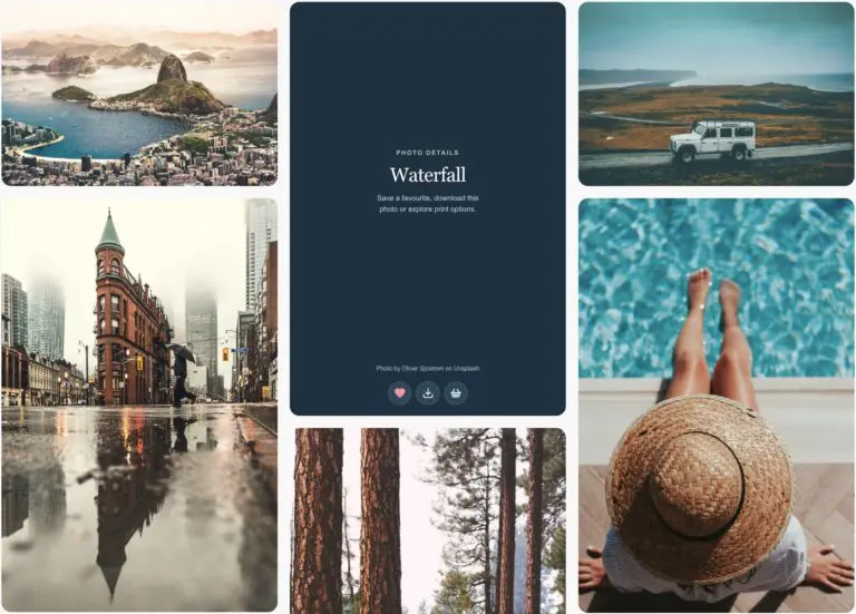
08 / Flip-side photo cards
The photograph forms the front of each card. Hover or use keyboard focus to turn it over and reveal its title, photo credit and favourite, download and purchase icons on a deep-blue back. Touch devices show the same information as an overlay.
View & copy the complete CSS — Flip-side photo cards
Paste this complete snippet into Gallery Template → Custom CSS.
Enable native image titles and your desired action icons.
Hover or focus a card to reveal its back. Photo credits come from the widget’s existing caption attribute. Touch devices use an information overlay.
No gallery HTML or layout changes are needed.
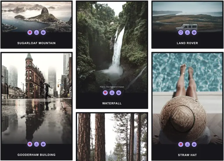
09 / Midnight film
A black frame, condensed uppercase title below the photo, and glowing medallions crossing its lower edge. Credits fade into the image.
View & copy the complete CSS — Midnight film
Paste the complete snippet into Gallery Template → Custom CSS.
Enable native image titles and your desired icons.
Credits use the widget’s existing caption attribute when native caption output is disabled.
No HTML changes or extra classes are required.
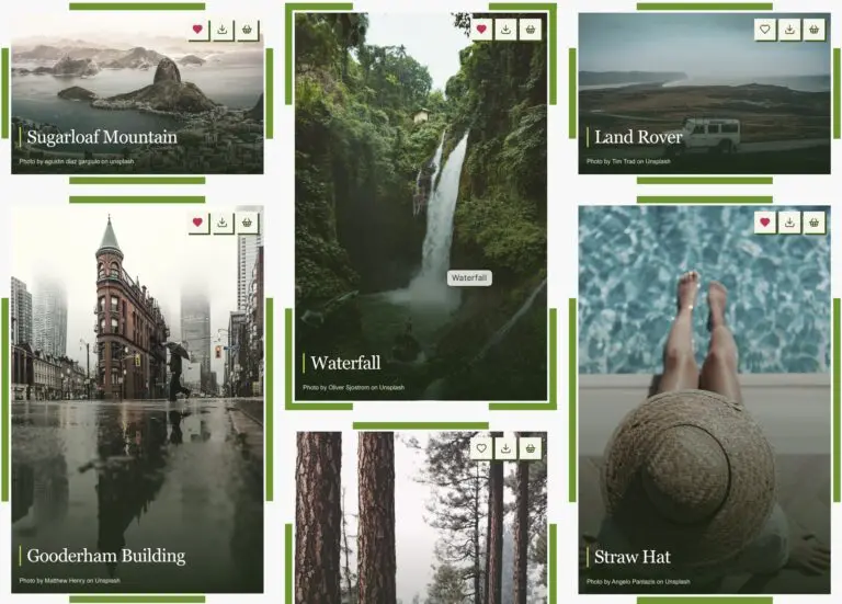
10 / Marching green frame
A segmented green border travels around each photograph on hover or keyboard focus, while the image returns from half greyscale to full colour. Squared action buttons and a fine green title marker echo the frame.
View & copy the complete CSS — Marching green frame
Paste this complete snippet into Gallery Template → Custom CSS.
Enable native image titles and your desired icons.
No HTML or gallery layout changes are required.
Real widgets, native content. Every example uses the ShutterPress Gallery widget with native titles, captions, favourite, download and purchase icons. Styling changes only the existing elements. The CSS does not set gallery columns, gaps, item widths, outer item positions or row heights.
Outside-image treatments use internal padding, so their cards have room for type and actions. On this draft page, styles are isolated to each example; the copyable snippets rely on the gallery template’s automatic scope. The source gallery and its live template remain unchanged.